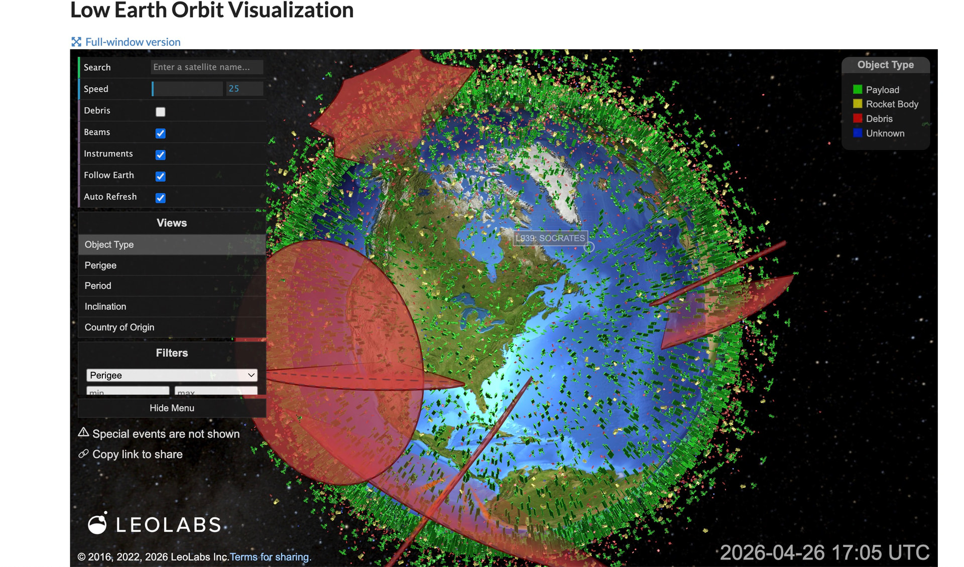
From an online conversation about tracking earth orbiting satellites (many of which continually fall and land on Earth), someone referenced this amazing LEOLABS Low Earth Orbit Visualization that tracks in real time the position of them (note the red ones marked as debris).
What are data visualizations you know that are impressive in their ability to present and make data understandable? What are ones that make you stop and say, “Wow”? Or what are ones you regularly use?
A few more from my bookmarks:
- Calculating Empires - A Genealogy of Technology and Power Since 1500
- What if you could search every visible word on New York City’s streets?
- Country Centered Map Projections What does it look like if you center a map on a specific country? Click on a country to find out.
- Global AI Vibrancy Tool Which countries are leading in AI?
- Global River Runner - pick a spot anywhere (in the US) and follow its path of flow where it ultimately will go
- Dollar Street - In the news people in other cultures seem stranger than they are. We visited 264 families in 50 countries and collected 30,000 photos. We sorted the homes by income, from left to right. (from Gapminder, CC licensed)