There is no case needed to made here, anywhere for climate change (I am ignoring the ignorants who ignore science), but came across this week two fascinating means of “seeing” it locally as a visualization. Here are two for this week’s monday-connect
First, one you may have seen rippling across your socials is ShowYourStripes,, a visualization of yearly temperature change in world regions, cities going back to 1900. Created by Ed Hawkins at the University of Reading, it shows rather clearly the stripes run from mainly blue to mainly red in recent years, illustrating the increase in average temperatures in locations.
The closest location to me I could find stripes for was for Calgary Alberta

You will see variation in many portions, a notable bluish periods in late 1960s to mid 1970s, but stand back and you can see the trends.
How about finding your stripes and share them here? Are they different in any way? Or migh they make for some kind of art.
Speaking of art, I also came across this little fun visualization shared by @dajbelshaw that represents your current local weather (which we know is not climate) https://rothko.joonas.wtf/ as a matching abstract art painting by Mark Rothko.
It probably sounds a bit bizarre, but give it a spin and share the results.
I tried last week on sunny day and got No.5/No.22 (“Bright open weather — the yellow field carries the same radiant hour.” ) but the canvas is much different today on a rainy Sunday.
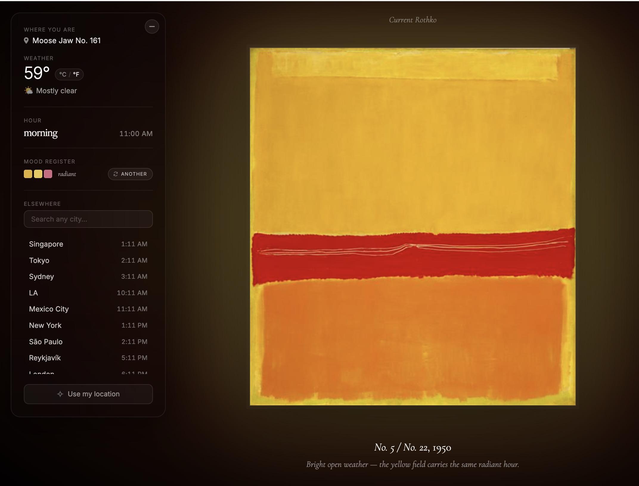
Find your local weather and share the location and the matching Rothko art. Does it. match?
Also, as aide discovery for the images used in this site, WikiArt and utterly amazing resource and source of artworks and information about art. It alone is worth a but more exploration.
Share your Stripes! Share your Rothko weather report! Let’s compare.