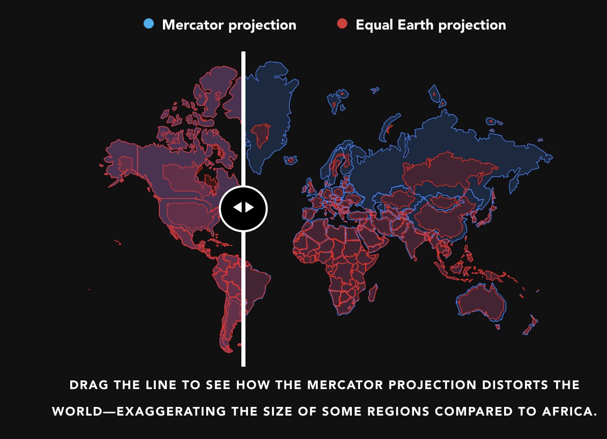
Learn more and explore the interactive comparison of these global maps at Correct The Map.
The UN recorded 164 votes in favor of the resolution, with 6 abstentions and only a single vote against it from a shrinking projected size North American country.
The Equal Earth projection map is made available for downloading and printing for free, the map has been put into the public domain.
For some more on this issue, it seems like we may not see this map in our apps
And noting from this article the infographic created by Kai Krause making the distortion of Mercator projection for Africa, see The True Size of Africa (public domain).
This in turn inspired developers James Talmage and Damon Maneice to create The True Size Of… a web site where you can recreate that kind of graphic comparing the sizes of other countries, continents. It’s fascinating!
According to the Ars Technica article, the developers were also inspired by map projections included in an episode of The West Wing
While I am definitely supportive of the Equal Earth projection map I don’t like the slider tool that compares sizes, because it simply takes Mercator projection outlines and makes them smaller. But the amount of correction needed at the 49th parallel is quite different from the correction needed at, say, the 60th parallel. That’s why we get artifacts like the different lengths of the border for Canada and the US. A country like Canada should be wider at the bottom, narrower at the top (same for the US, which also has an inconsistent border length with Mexico).