Look What's New in OEG Connect

Today I explored some new features in the Discourse (open source, yay) platform that runs OEG Connect. If you take a look at the main entrance, perhaps you will notice what’s new.


Pixabay image by geralt reused under the Free to Use Pixabay content license

Search Top and Center

There’s a lot of things here! Search is your friend. What was previously under a magnifying glass icon is now top center as an instant OEG Connect search. But there’s more, click the 3 line icon on the right of the search box for a raft of search options (within a category, by date, by tag, etc).

Welcome Banner

When you visit OEG Connect, that search box is slid below a big welcome banner. If you are logged in, it will even greet you by your user name (oooooh, it’s so personal). If you are not logged in it will say simple “Welcome to OEG Connect”

Better Featured Topics

For a while we have listed at the top of the main entry the four most recent topics tagged featured. There were some technical issues with the way that was done,. so instead we found a better plugin that does it more elegantly,

Now on every visit to the main entrance, you will see four random posts tagged featured so its not always the same.

If you create a new topic and want it feature, well add the featured tag yourself. Go ahead? (Hint- the display as you can see is better if there’s an image, so if you have a topic to feature, make sure you upload at least one image).

Emoji Icons for Categories

Do you make use of the left side navigation panel? Previously all the categories were displayed with different colored sqaures. Now each has an emoji, woah, this is innovative!

Did you know you can customize what appears there? Just look for the little pencil icon next to the Categories label. You can pick the ones you want to see there.

Wait For More!

Look soon for a regular series of Connect How to tips. But look around, and while you are at it, why not reply to a topic? Or maybe add one of your events to the OE Events area? Got something to share? Add links and details to the OE Sharing Zone, it should not just be stuff from me.

Just want to pose a question? Or declare your ownership of an island full of penguins? Anything goes in the OE Global Plaza

In any category / area, start something new with the New Topic button. And if its worth featuring on the front page, well use the magic tag.

While I like Discourse a lot, my experience is that users find it confusing - I wish there were a simple way to explain the melange of posts, topics, groups, channels, categories, and tags. When I was working with discourse I tried to find a way to simplify the interface so that people were looking at two dimensions, not five. I was not successful. The new featured topics will help readers a lot, and allow them to ignore the jumble in the left hand column. I like it.

Thanks Stephen, I. have wrestled with the confusion factor of Discourse and imagine others here feel the same. It’s no different from many platforms in that the balance of many features and capabilities under the hood are at odds with the simplicity of the user interface,

That said, the basic acts discussion are hardly complex. Got a question? Something to say? Start a new topic. See a topic you can contribute? reply. That hardly seems a challenge.

And we see multiple new signups here yet not sure what people are looking for or interested in. I just keep trying to guess at what will instigate conversations. I do very much appreciate both how you reply here but also when I see you share items from here on OLDaily.

A good amount of the mess here is that I have added on the left side jumble in various efforts to organize things. Were I to start over I’d try to do less so with categories. But then again, our real world is jumbled and complex, and hardly organized into neat little boxes. Frankly, a bit of mess and sprawl, at least to me, is approporiate.

Thanks for adding these features @cogdog! Definitely some to implement on potential upcoming client sites :slight_smile:

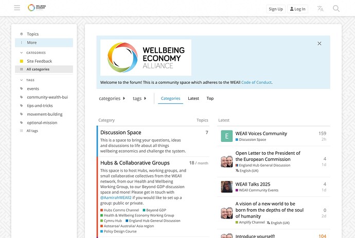
Per @Downes’ comment, on the WEAll community site, the feedback was that they wanted a combination of quick navigation and serendipitous discovery, so we ended up with this:

Not necessarily suggesting it would work here, but just in case it’s useful for Discourse-curious others reading this thread!

Thanks for the example, Doug, the WEALL community site sure looks like it has achieved that balance. Having all of the focus categories under “Hubs and Collaborative Groups” is appealing, and then the other top levels are clear as types of actions that support the community.

I’ve tried many that category front view (it still lurks).

The sprawl here, again, was a combination of trying to perhaps overly organize by categories, and I would now recommend a flatter structure like the Well Being space, no more than one subcategory deep. Also, much was added on here was we went, rather than from the outset.

There is the community building part of maybe what we think of as these structures, which are definitely important, but also the lesser known factor of the building that happens organically from contributions/participation.

Thanks for the example, I will come back to it again.